We were approached to create a brand for a London jazz-crossover festival that's inclusive of people, cultures and genres. A celebration of jazz which brings people together to ignite joy, energy and renewal in jazz communities and a wider audience.
A brand that is different, energetic, and lively. A brand that encourages the audience to think differently, to shatter the traditional idea that jazz only has a narrow offering.
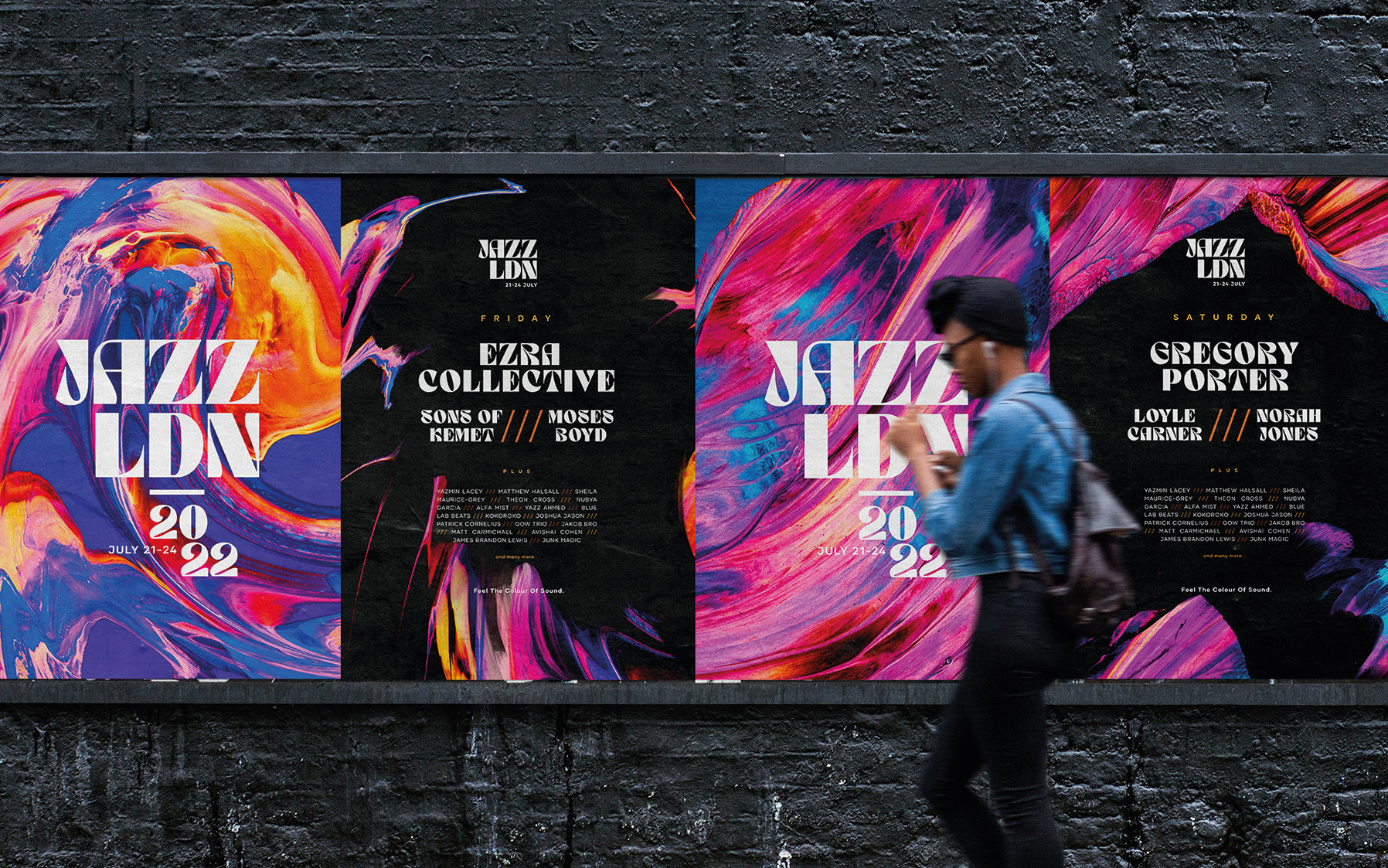
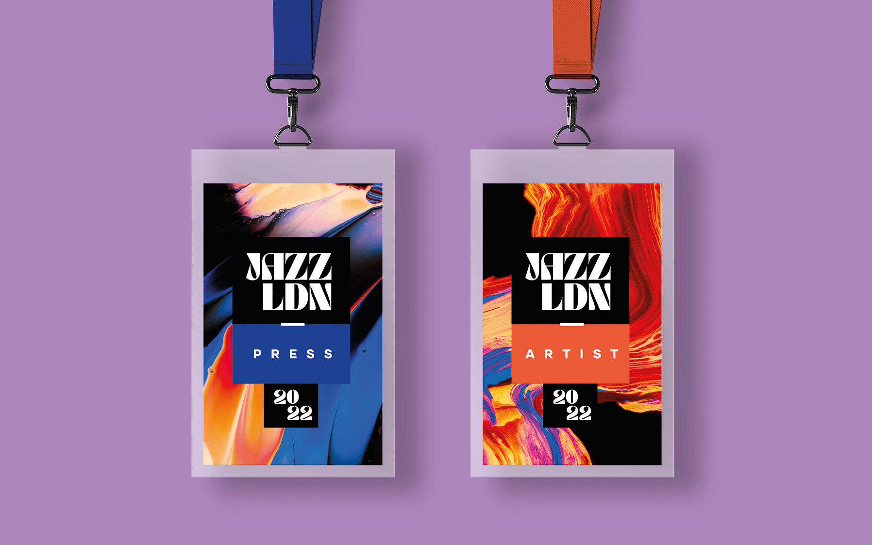
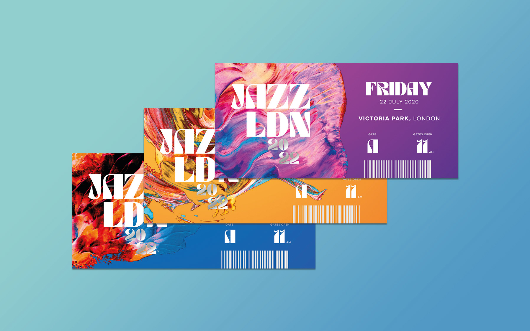
The following shows the brand design created for the Festival.
Designed at Dare Creative.
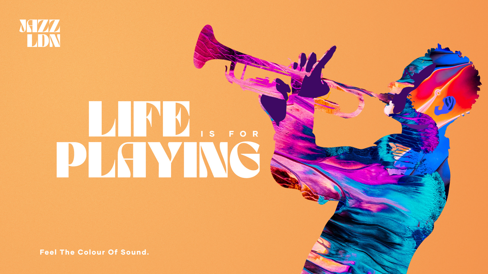
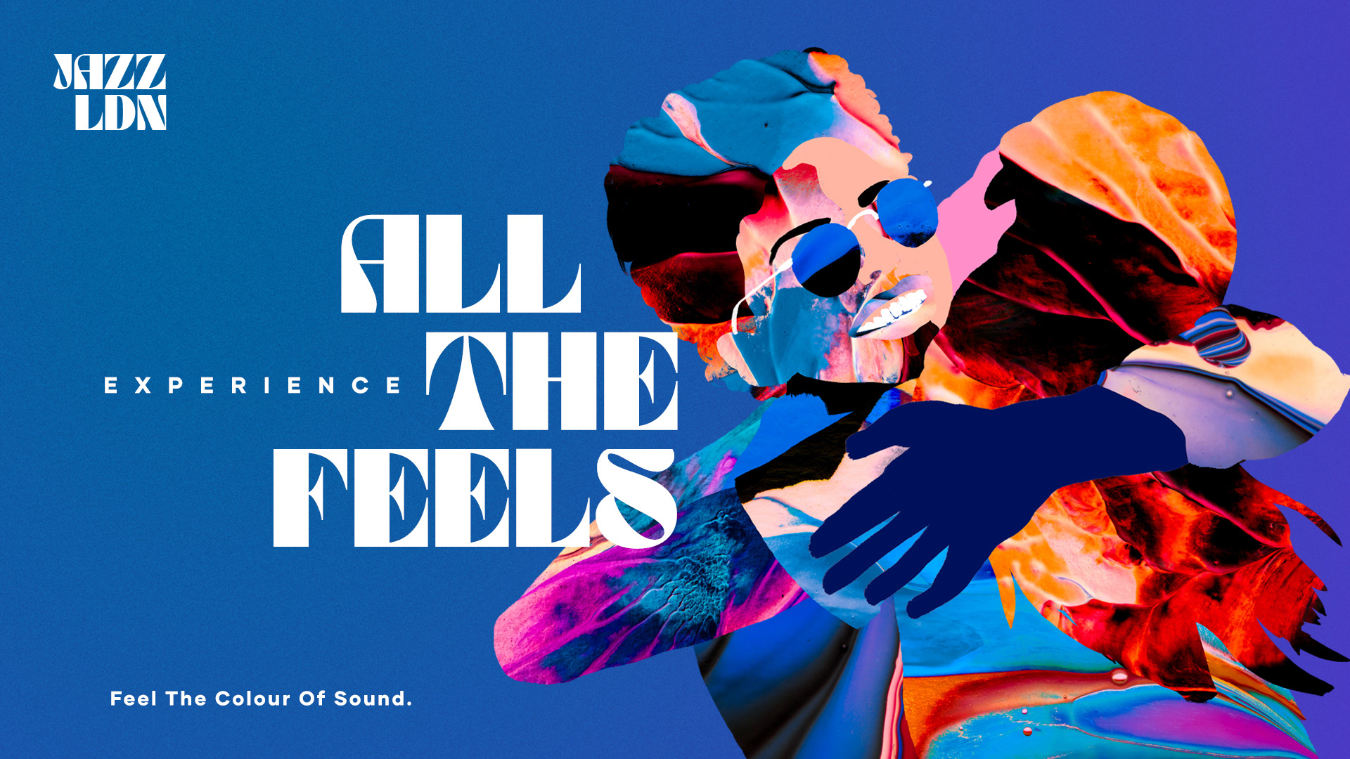
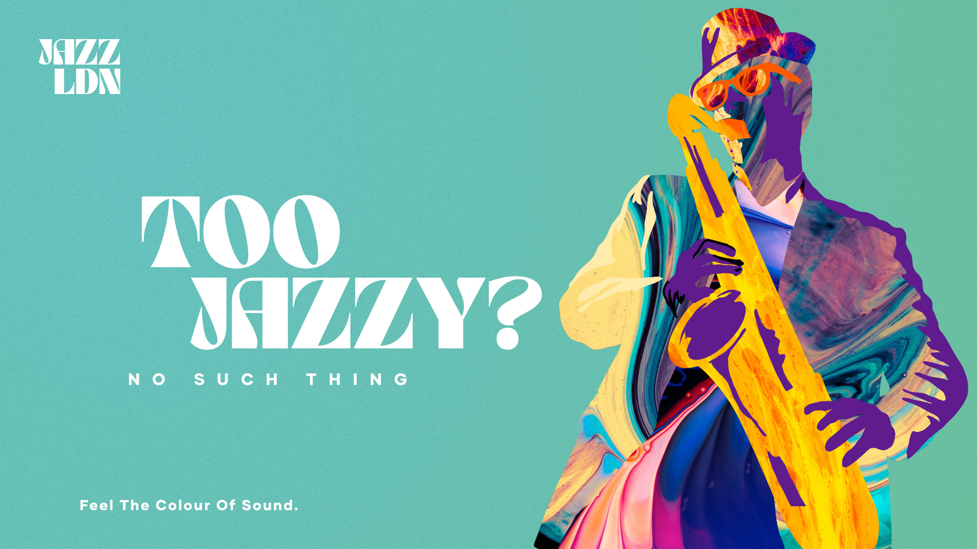
FEEL THE COLOUR OF SOUND
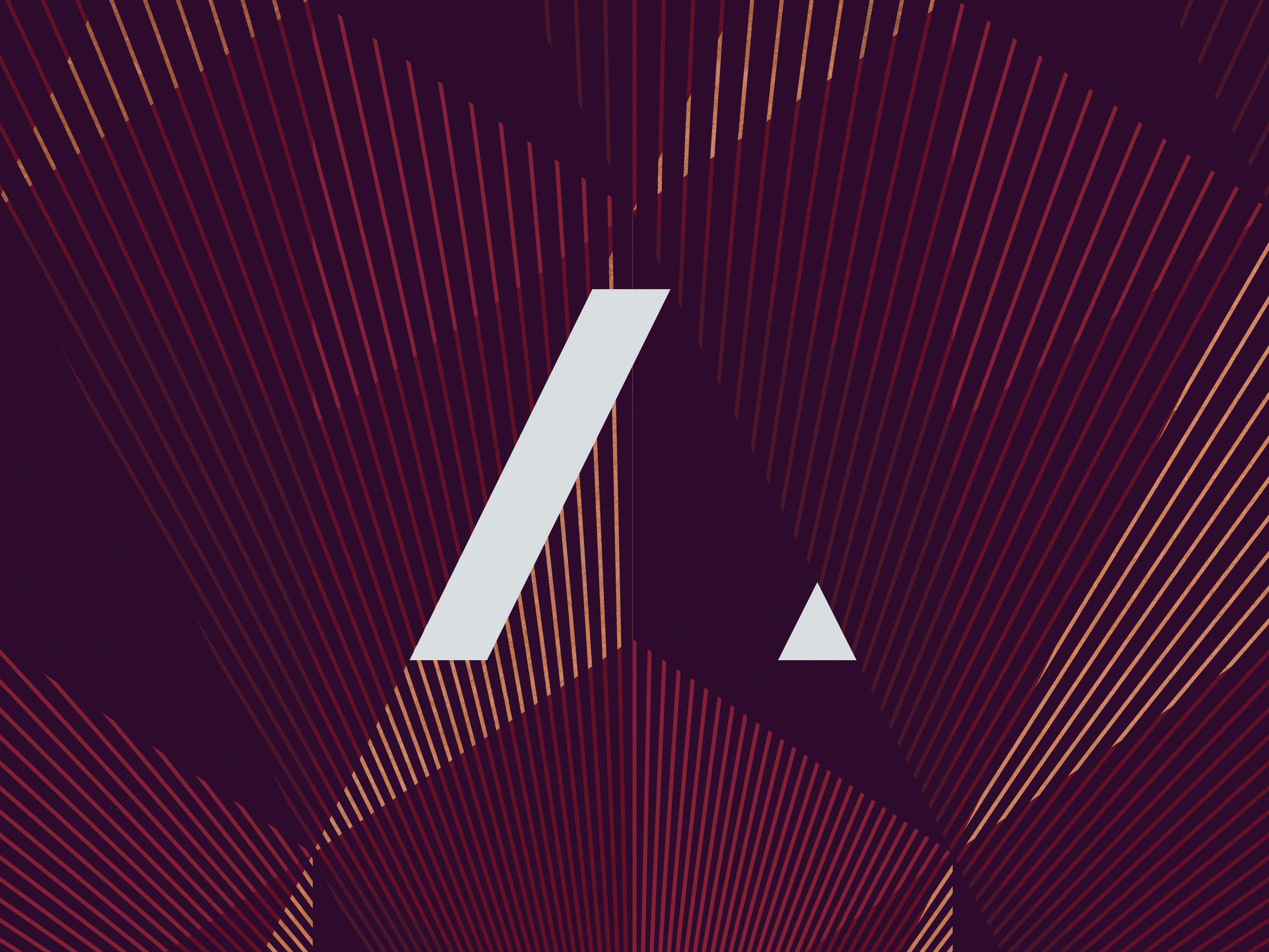
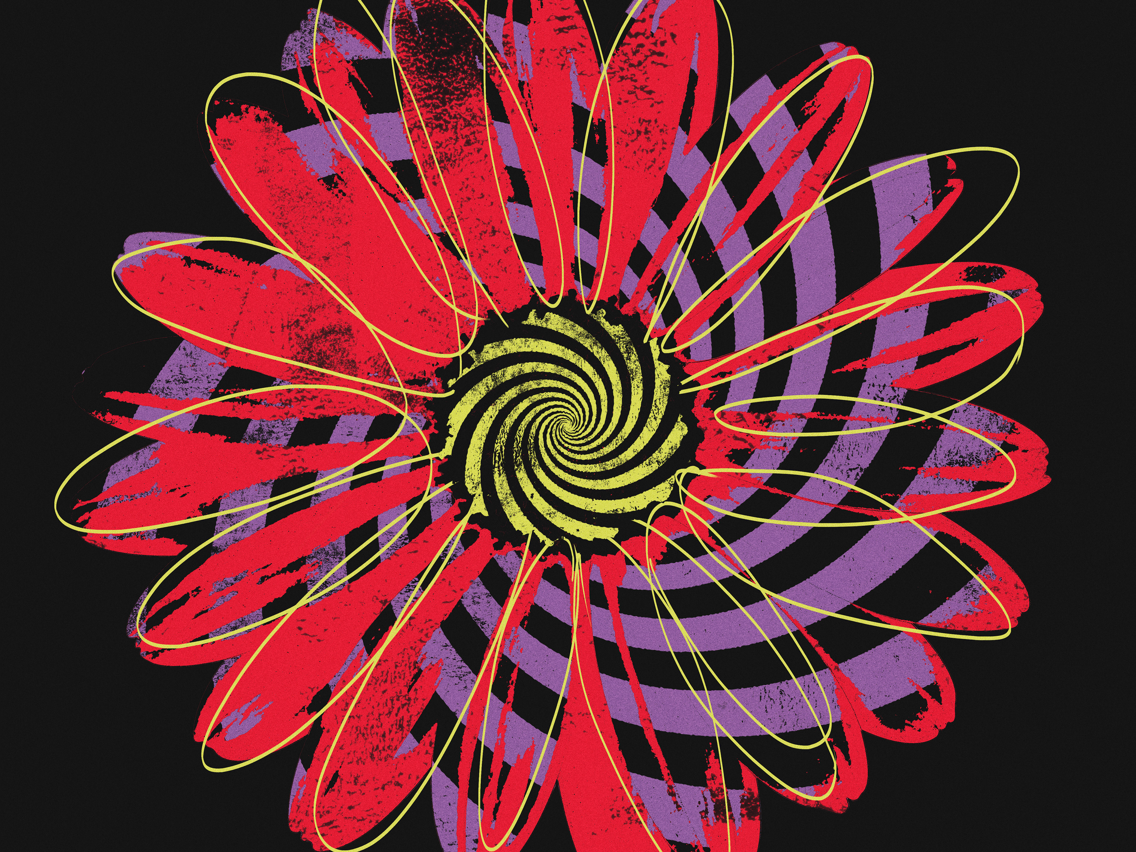
Music takes us on a journey. We are guided by each note and every beat telling a story of how that particular Musician feels. Their instruments act as amplifiers to their emotions and are a direct line to the soul. We hear their pain with each sombre tone and experience the toe tapping joy through the beat and tempo. As D C DowDell said, “Music is what feelings sound like”. This concept aims to portray the emotion and feeling that music evokes within us through the use of abstract shapes, colour and texture.
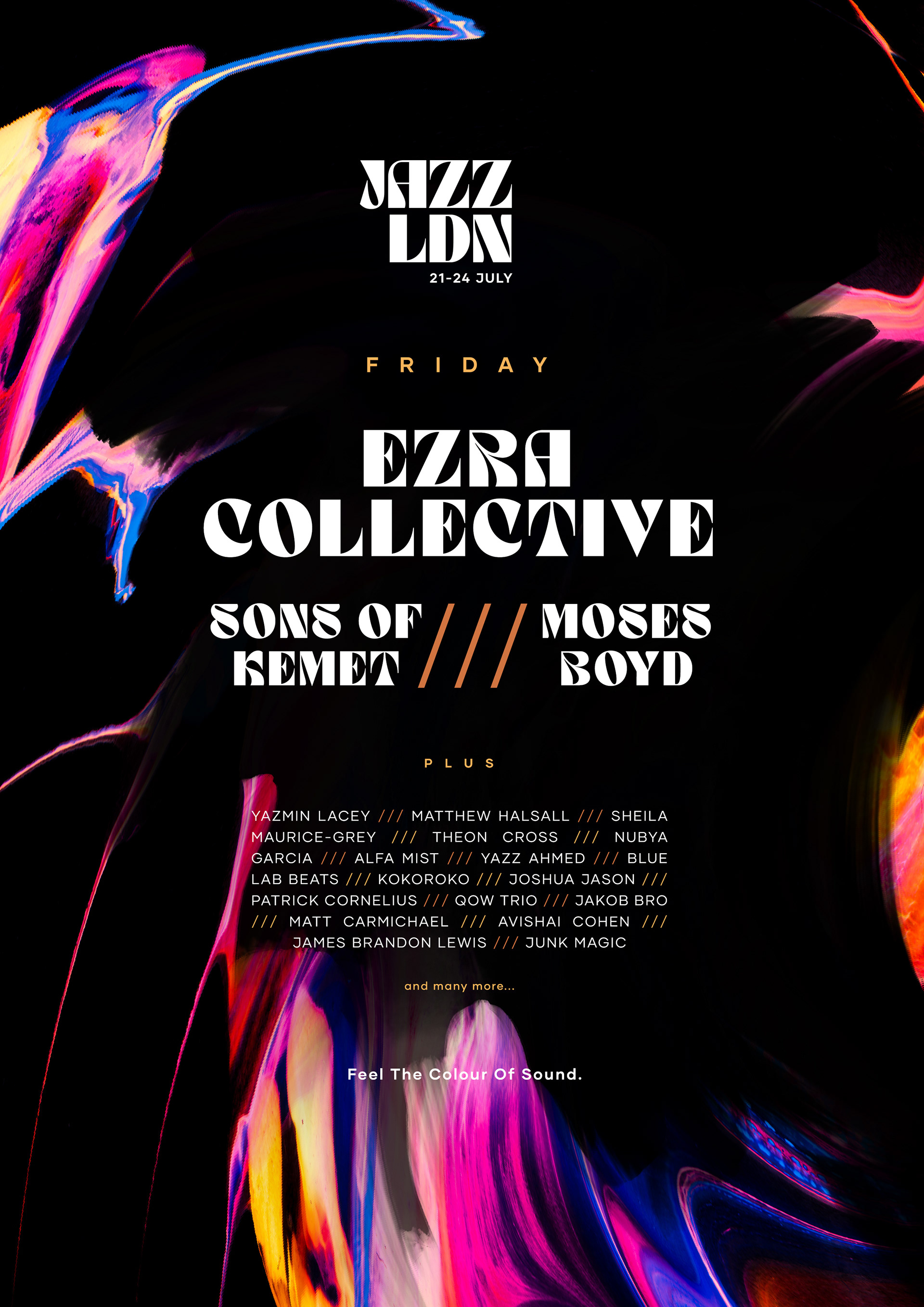
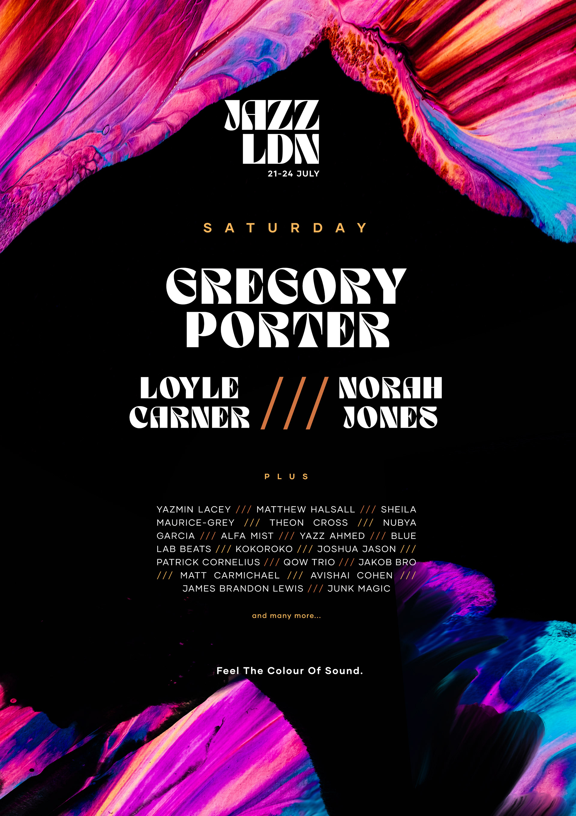
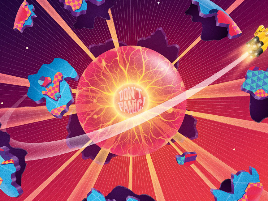
The plan was to create a series of colourful textures and illustrations that will not only represent each genre of music, but the feelings they evoke.
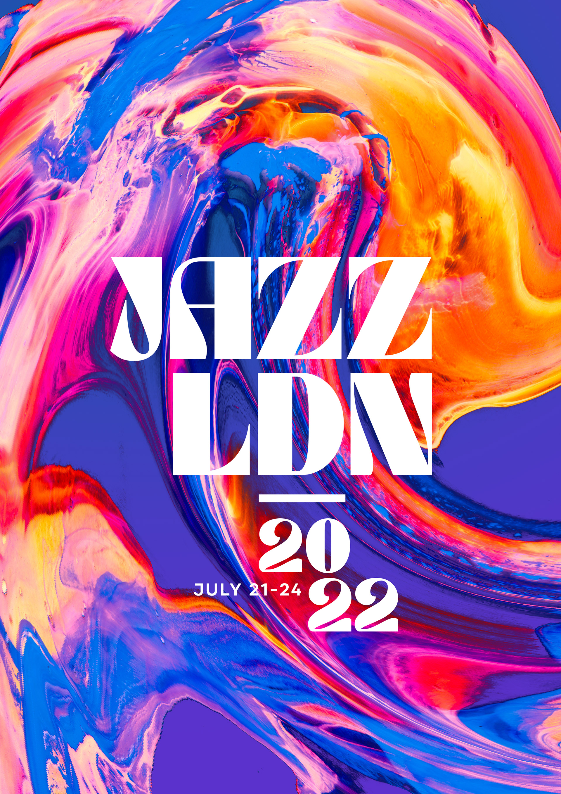
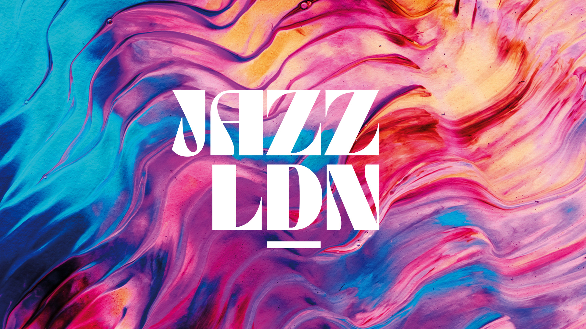
JAZZ LDN is... Emotive. Vibrant. Community.
INITIAL STYLESCAPE
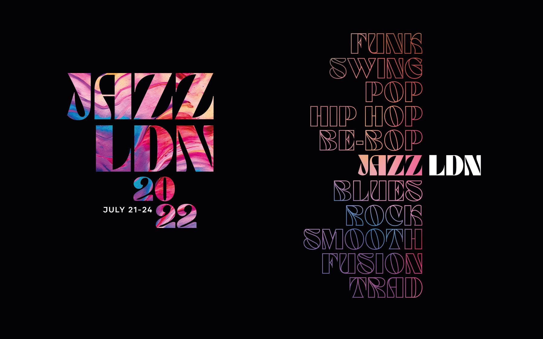
SHORT AND SWEET.
Our logo type abbreviates the "LONDON" to LDN in order to create a more impactful and balanced mark. In doing so it also helps to differentiate itself from the LONDON FESTIVAL OF JAZZ. This technique would be continued throughout the branding to help convey the range of styles in Jazz & Crossover, Diverse Cultures and all that the festival has to offer. Below shows an example of how we would animate the through each genre before finally settling on JAZZ LDN.
Using Colour psychology we have grouped a series of emotions associated with our key brand colour groups. These colours will help to define the emotions we evoke whilst listening to all genre's of music. Additionally, the abstract colour textures use colour this psychology, but also help to convey the tempo, feeling and emotion of each genre form. The expressive splatters, strokes and flow will further help to distinguish each genre.
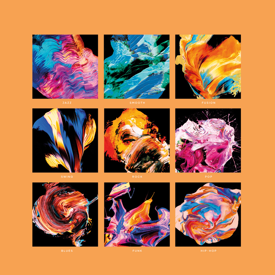
COLOURFUL EXPRESSIONS
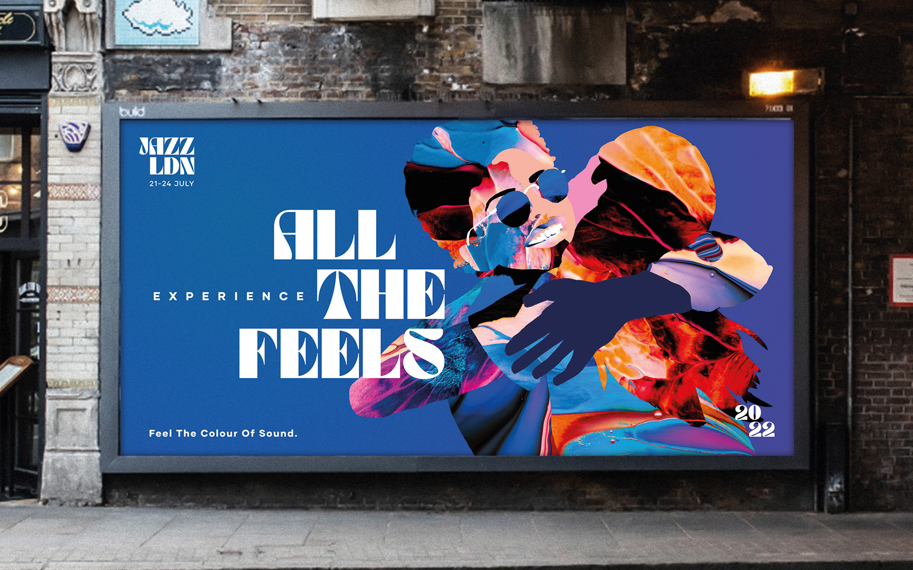
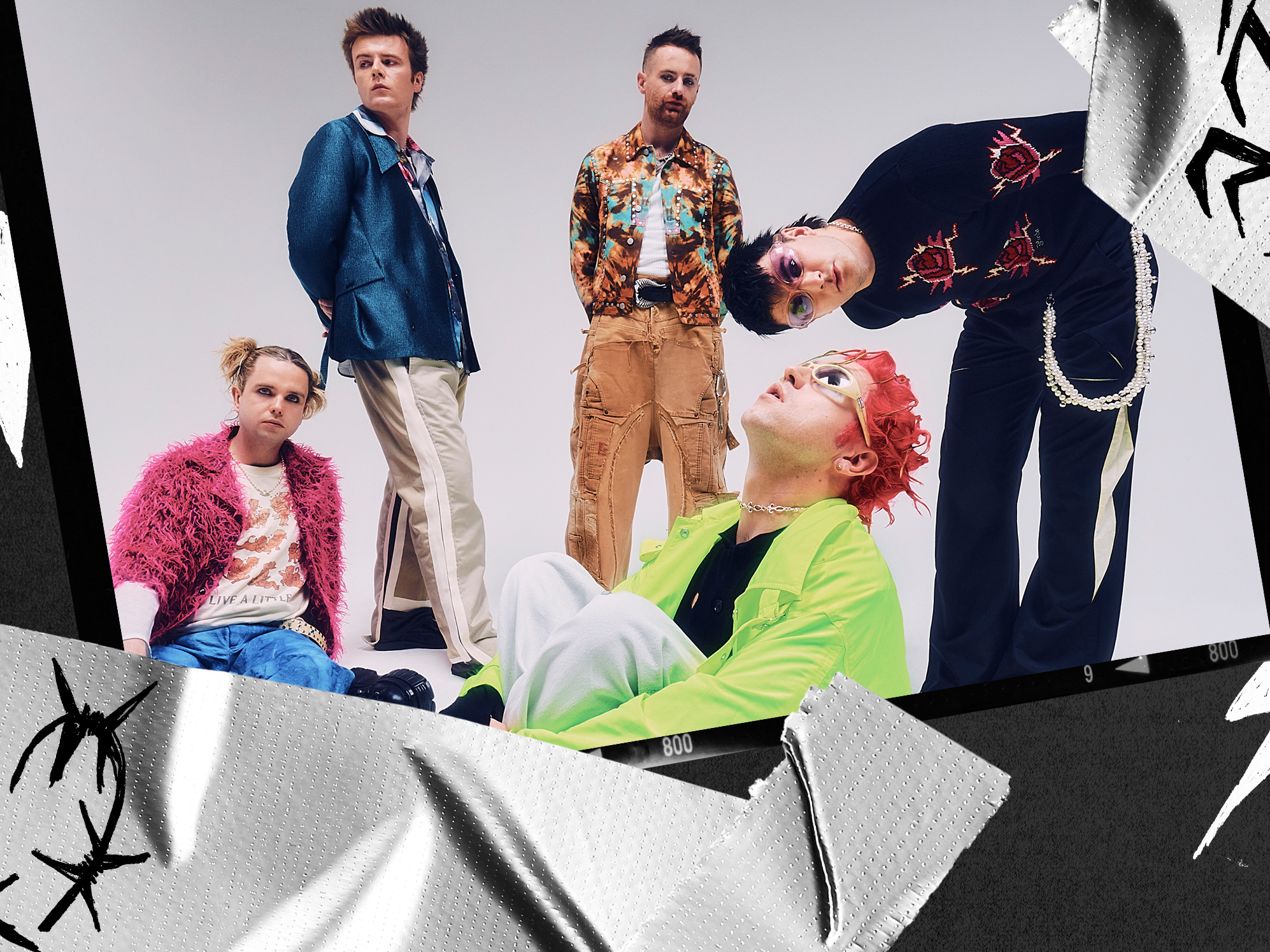
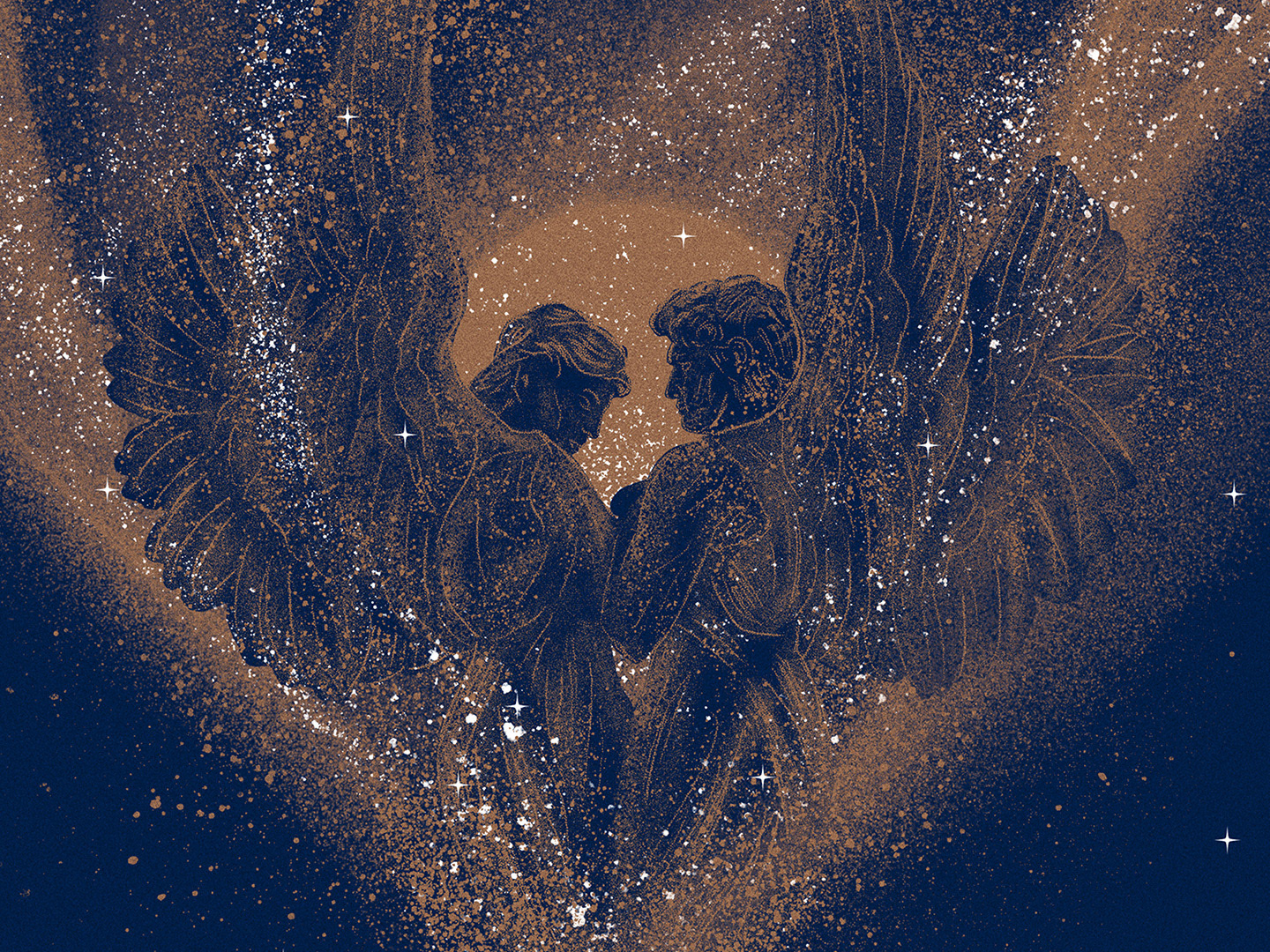
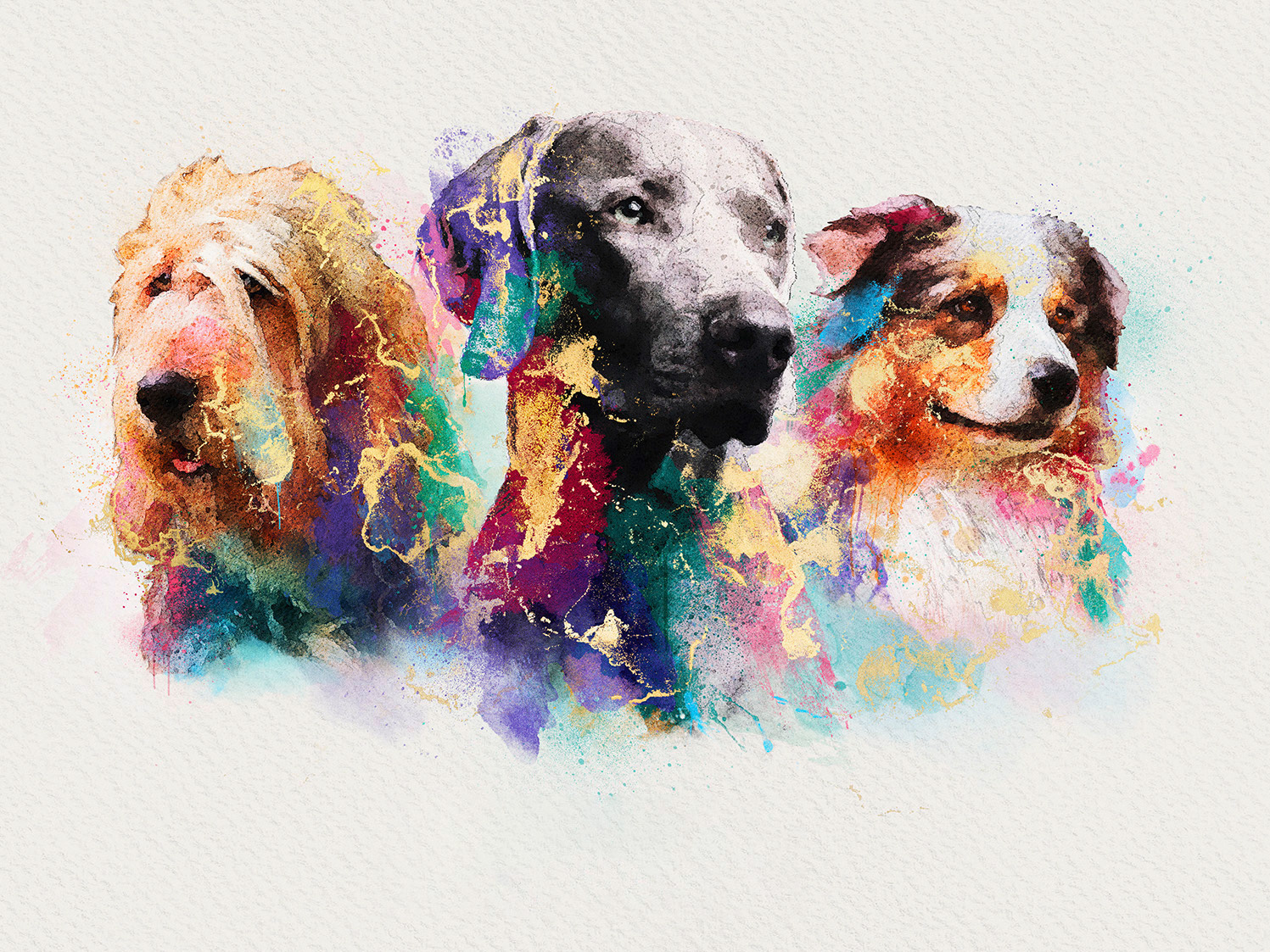
We created a stylised illustrative brand personality which shows the human element of the brand experience, the joy of the music and being at the festival. Emotive with colour, our illustrations of hugs, dancing, laughter, friends and music will display all of the things we have missed during the nightmare of COVID19.

The following shows the brand principles in action.